
OUTFLOW
Native iOS Application
Outflow is a native iOS expense tracker built to solve a singular problem: the overwhelming interaction fatigue of modern budgeting apps. In a market saturated with ad-heavy, subscription-gated trackers that demand tedious manual categorization, Outflow introduces a "less is more" philosophy. By combining an ultra-minimalist UI with an adaptive keyword database, the app flips the script on data entry.
The more you use it, the less you have to.
To challenge my end-to-end execution capabilities, the entire application, beginning with a strict definition of the problem statement before moving into the UX concept and functional code using Xcode, Expo, and CocoaPods, was built within a strict 5-hour timebox. Leveraging agentic coding workflows, I managed to drastically compressed the engineering timeline, leaving critical buffer room to conduct rapid user testing and iterate on the live build before the clock ran out.
Project Type
Agile, AI-Native, Claude Code, Minimum Viable Product (MVP) UAT, UI/UX, User Research
Team
Daniel Yeo
Year
2026


Problem Statement
Expense trackers often require users to manually input multiple types of information. This tedious data entry reduces their motivation to persistently track spending, especially when dealing with multiple transactions.
Goals & Objectives
A minimalist expense tracking app that monitors your spending over days, months, and years. Completely ad-free and stripped of tedious, unnecessary inputs.
Background
The application was born out of my own frustration with "app-hopping" at the point of purchase. I was constantly juggling banking apps to pay, tracking tools to log, apps to share costs, and native notes just to keep a mental tally across different currencies.
Cross-Currency Headaches 🤕
Most tracking apps treat multi-currency transactions as an afterthought. When spending across borders, keeping a clear, consolidated view of total expenses required manual mental math, constant exchange rate checks, or juggling external conversion tools just to log a single purchase accurately.
Multiple Input Required 📑
Traditional trackers suffer from a UX paradox, requiring heavy cognitive load at the exact moment of purchase. Forcing a user to manually select the name, exact cost, category, date, and split-status creates tracking fatigue, ultimately leading to abandoned apps and unlogged expenses.
Solution
I wanted something that eliminates this cognitive overload by condensing the entire process into a frictionless, single-app experience that does the heavy lifting for you. It should require minimal inputs from the user, while being able to improve its own data and quality in outputs even without the use of internet, LLMs or APIs.
Features
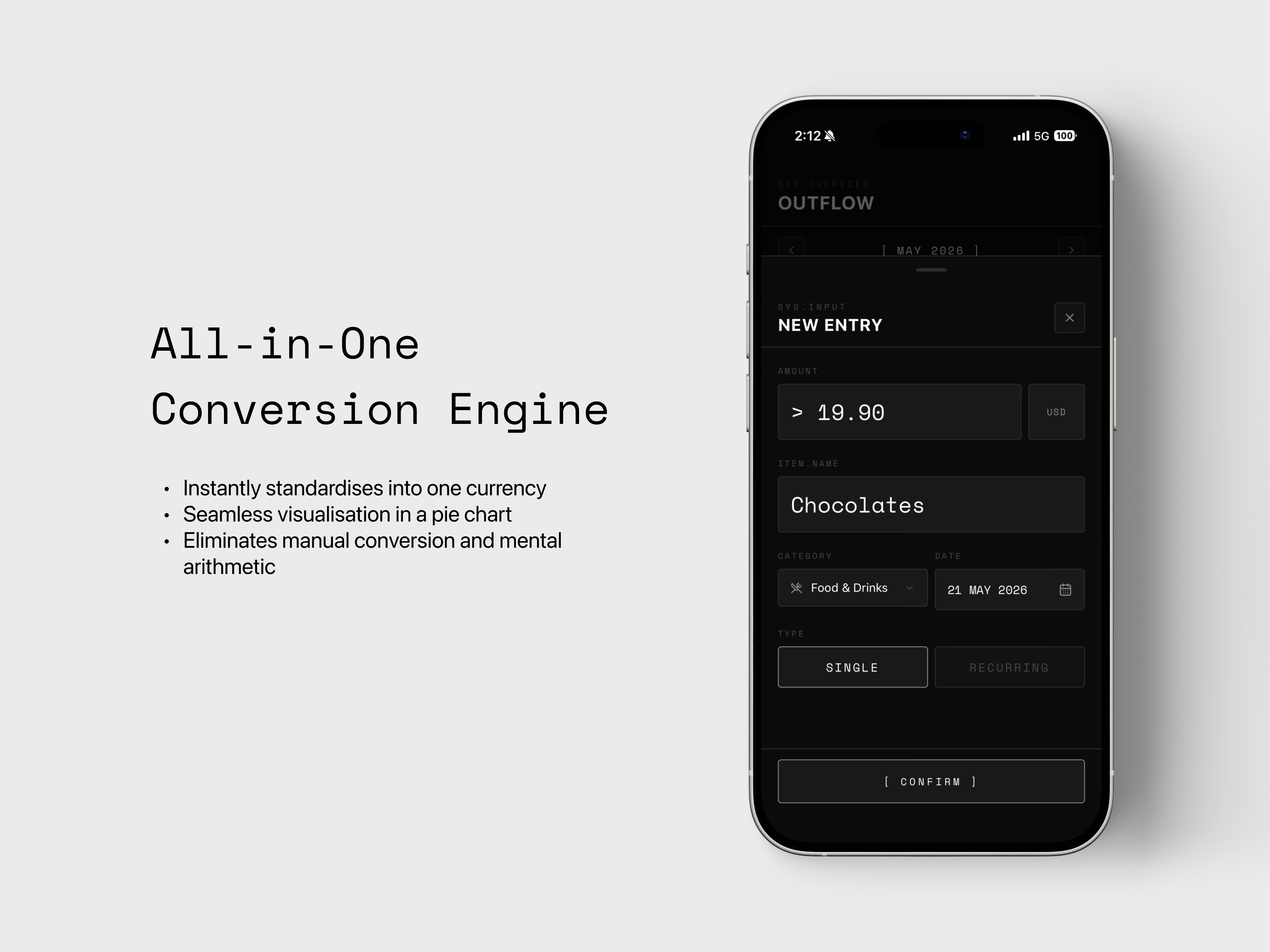
All-in-One Conversion
An automated multi-currency engine that instantly standardises all global purchases into the user's default currency for seamless visualisation in a unified pie chart. It allows users to log expenses in any currency and completely eliminating manual conversion and mental arithmetic.

Features
Simple Two-Step Input
This feature streamlines the logging workflow down to just two required user inputs: Cost and Name. The application utilises a keyword-learning engine that dynamically categorises purchases based on historical spending habits, creating an intelligent system that becomes more automated the more it is used.


Reflection
In a strict five-hour sprint, scope creep is a project killer. As a designer, my instinct was to build up from the bedrock of the user's primary pain point. The absolute MVP was defined by a zero-friction, offline-first logging experience that actively improved itself via keyword learning.
I focused entirely on perfecting that core interaction before layering on essential fallback features like data exporting, item deletion, and category resets. Eliminating the need for a complex backend or internet dependency, I ensured the app was blazing fast and hyper-focused on solving the immediate cognitive overload of point-of-purchase tracking.
Even within this compressed timeframe, a product designer’s touch was essential to prevent the interface from feeling clinical or disjointed. While the agentic tools could generate functional components instantly, they frequently overlooked the subtle micro-interactions that define a premium user experience. I found myself actively stepping in to refine the visual hierarchy, tweak typography spacing for better readability on the go, and ensure that transitions felt fluid rather than abrupt.
This balance of aggressive functional scoping and meticulous visual curation allowed me to ship an MVP that was not just working, but genuinely intuitive to interact with.
